Conference branding
Greenpack
Sustainable Packaging Design Conference
My role
Research
Design

Summary
In this branding project, my objective was to create a visual identity for an imaginary 3-day conference centered on sustainable packaging and customer-centric design. The conference served as a platform for industry professionals to connect with packaging manufacturers, gain insights from inspiring keynote speakers, and foster knowledge exchange.
Understanding the goal, I designed and delivered a compelling identity that align with the conference's values by integrating design and sustainability within the context of a conference environment, ultimately contributing to the success of the event.
Timeline: 3 months
Tools: Figma, Miro, Adobe Illustrator, Slack, Zoom, Google Suite
Deliverables: Brand Identity(Logo, Pattern, Color, Typography), Conference App, Landing Website Marketing Poster Tape & Stickers, Mock-up
Deliverables
Poster

1.Problem
The Why?
Driven by my strong passion for sustainability, I conducted research and uncovered that the product packaging industry is a major contributor to waste, leading to global warming, ocean pollution, and overflowing landfills. Moreover, many sustainable materials in the market often lack visual appeal or won’t perform as well as non-sustainable ones.
However, it's crucial to recognize that packaging design plays a pivotal role in enhancing the customer experience. It serves as a vital marketing tool that promotes brand identity, showcases a product's best qualities, and leaves a lasting impression on customers.
Thus, to target these issues, I've structured the three-day conference theme as follows:
1 – Environmental impact of packaging, packaging end of life
2 – Sustainable packaging material basic
3 – Impact of sustainable packaging & customer experience
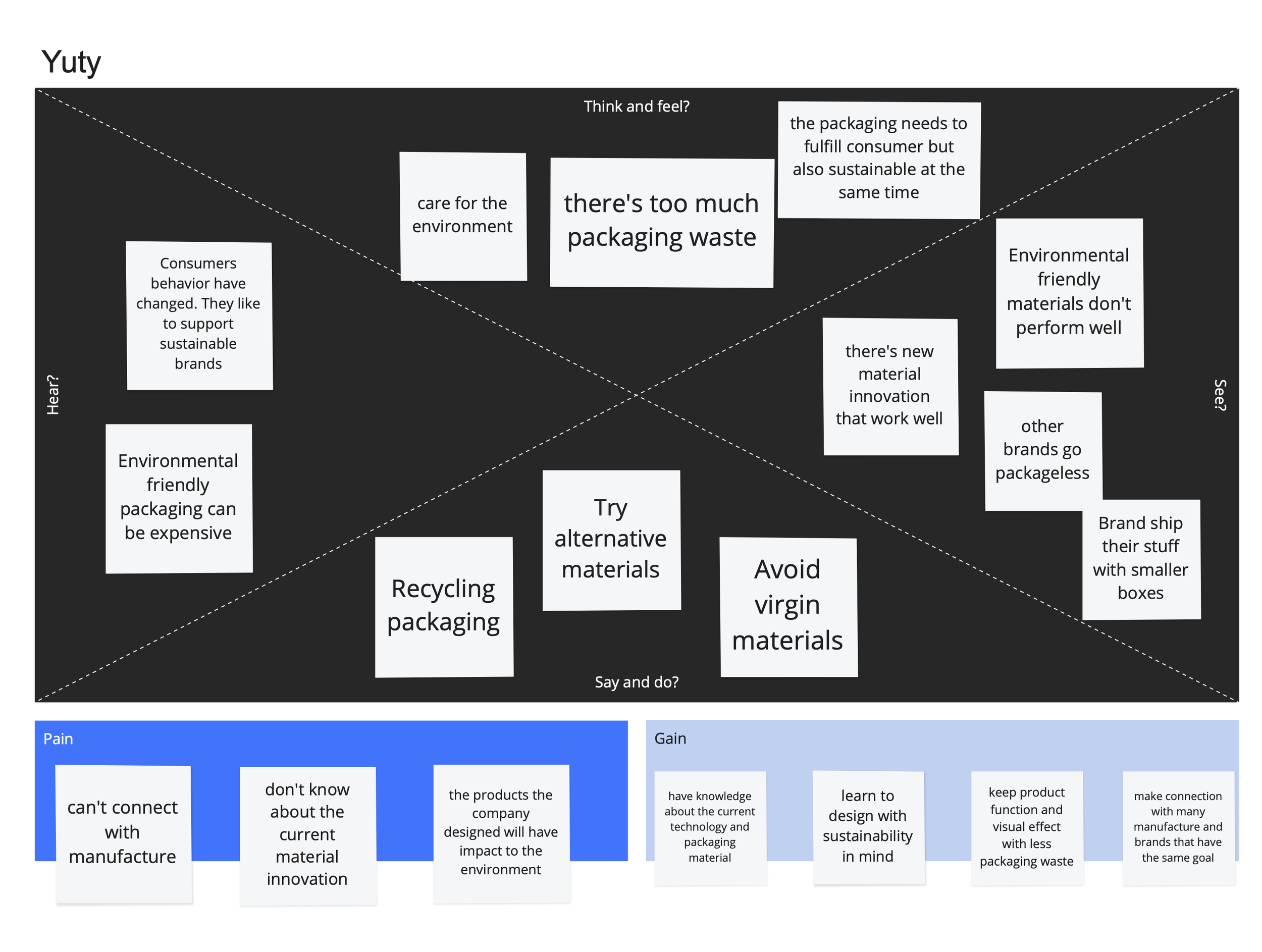
2. Research
Define audience & empathy map
Answering these questions and making an empathy map allowed me to gain a deep understanding of the audience. This understanding is crucial because I could make design decisions that capture their attention while still resonating with the conference's message.

Naming
I started brainstorming based on some of the adjectives that exist within my topic. I was drawn to a GreenPack, and PackXplore. But eventually decided on GreenPack because it's a combination of Green & Packaging, which isn't too literal but not too abstract. This name most effectively encapsulates the core connection between sustainability and packaging.

Brand visual inspiration

Clean, Professional, Sustainable. I then started to collect inspiration from Pinterest and came up with a visual audit board.
3. Design
Logo inspiration

The logo was created by incorporating the letter G, an isometric cube, and a recycling symbol.
Final logo & lock up
The straight lines & sharp edges of the cube make the logo feel modern and professional. These characteristics are also carried through the type. The smaller cube is added in the middle to create depth.

Logo
Lock up
Typefaces & color
Neuzeit Grotesk – modern and simple, while its line work goes well with the existing sharp lines in the logo cube. This is paired with a san-serif font – Greycliff CF. It's a modern, versatile font that works great for body copy.


Green is the dominant color in the palette because it reminds us of the environment, nature, and sustainability.
Patterns

Patterns are designed using simple line work and based on the hexagon shape created by the logo
Icons
Following similar characteristics from the created patterns, I created outlined icons instead of solid-filled shapes, and this ensures a unified and cohesive brand representation.
Poster drafts

To tie all the visual elements together, I wanted the poster to be isometric like the logo.
Final Poster

App Flow

The app is designed to provide attendees with easy access to the conference overview, session schedules, and speakers, and to register.

App Wireframes
App high-fidelity prototype

To make registering easy, the home screen has all the necessary information like price, date, time, and location and an obvious CTA so people can go ahead and register right away.

Landing Website
The grid lines structure from the poster is carried through to the website and becomes the pattern on the web. The website provides people with an overview of the conference, sessions, and speakers. People can directly register on this website or by our app.


Marketing
The marketing for the conference includes packaging tape with the conference pattern and logo. The marketing plan is to send out these tapes for attendees as gifts so they can wrap their packaging with them.


There are also hexagon stickers with the conference logo and pattern for them to stick to their personal belongings.
