Mobile App
Genie
A great solution for staying organized and making special occasions truly memorable with personalized gift ideas.
My role
Product Designer
Visual Designer

SUMMARY
During my capstone project, I developed an app with the goals of easing gift-giving stress and fostering human connection.
This idea came up when I reflected on my experiences as a daughter living far from home, striving to balance a hectic schedule while maintaining a strong connection with my family and celebrating their special moments.
The result? Genie, an innovative solution for a stress-free gifting experience, designed to tackle the challenge of staying organized with important dates while providing personalized and meaningful gift ideas. Givers feel accomplished and recipients feel truly cherished on special occasions.
Timeline: 8 weeks
Tools: Figma, Google Suite Miro, Slack, Zoom
Deliverables: Sketches, Wireframes, Mid-fidelity Prototype, High-Fi Prototype, App Mockup, 23 clickable app screens, Mockup

Home

Smart search

Gift recommendation
based on profile

PROCESS
Keep scrolling for in-depth design process
1.PROBLEM
Pain points & How Might We
How might we make it easy for people to stay on top of important dates?
How might we simplify the process of gift-giving, enabling users to effortlessly discover personalized and meaningful gifts, ensuring their loved ones feel truly cherished on special occasions?
With busy schedules, people struggle to stay on top of their loved ones’ important dates. Moreover, It’s time-consuming and difficult for people to find personalized or thoughtful gifts for their loved ones which often results in stress and frustration. Therefore, I approach this following questions:
Goals
With the aim of alleviating these pain points, I set out on a mission to create a solution that would:
Simplify Gift-Giving: My goal was to streamline the gift-giving process. I aimed to develop a platform seamlessly integrated into users' lives, enabling them to easily discover personalized and meaningful gifts.
Save Time: Recognizing the value of time, I want to eliminate the time-consuming and overwhelming task of searching for the perfect gift. My vision was to offer a user-friendly experience featuring curated gift ideas tailored to the recipient's preferences and interests.
Reduce Stress: I aimed to remove the stress and frustration associated with gift hunting by sparing users from scouring countless websites or stores.
Empower Users: My platform would empower users with a simple and effective way to stay organized with important dates. Timely reminders would ensure they never missed an opportunity to celebrate and honor their loved ones.
2. RESEARCH
Define audience
To ensure a user-centric, efficient, and tailored product that meets specific user needs, I need to define my users (Gen Z, Millennials). They are the ones who are more busy and find it challenging to keep track of important dates or find personalized gifts
Persona

My fictional persona helps me to empathize deeper with the audience, and understand deeper the difficulty they encounter when finding gifts for their loved ones.
Surveys
I wanted to gain insights into how people typically search for gifts, manage important dates, and what specific solutions they would find beneficial. So, I conducted quantitative research by surveying 13 individuals using Google Forms. These findings guided the inclusion of common preferences in the app's features.

When trying to remember dates
Most people want some sort of reminder feature that can remind them in advance, and provide gift recommendation.

When finding a gift
Most people encounter frustration and overwhelmed trying to find useful or perfect gifts for their loved ones
Interviews
I also performed two 15-minute qualitative interviews with a college senior and a professional. I asked open-ended questions about their gift-finding experiences, struggles, and emotions regarding important dates.
Card-sorting
In this phase, I presented the participants were presented with sticky notes containing potential solutions and features gathered from a survey, and let them categorize these elements based on their perceived importance for the app. The purpose was to identify primary (most important), secondary, and tertiary (less important but beneficial) elements to be included in the app.


Competitive Analysis
I also want to know what the current market is using, so I used the SWOT method to identify the strength, weaknesses, opportunities, and threats of 4 different competitive apps (Amazon, Etsy, Giftagram, Hip). After analyzing competitive apps using the SWOT method, then I conclude to:
Amazon: Offers a wide product range but lacks personalization.
Etsy: Provides a strong selection of personalized products.
Giftagram: Well-organized gift ideas by categories with in-app shipping but lacks reminders.
Hip: Offers countdown reminders and planning features, but charges $2.99/month for calendar access and redirects to Amazon for gift searches.
Research Takeaways
Users value practicality, usefulness, and personalization in gifts
Time-saving is a key factor
Reminder feature and organization are crucial
After analyzing and empathizing with user needs using data from user surveys, interviews, card sorting, and competitive analysis. I understand that:
Initial Hypothesis
From my takeaways, I came up with some hypotheses below and presented them to my stakeholders to verify my ideas. I was very glad I did this because they provided me with important feedback and we were able to further develop the solutions together.
Survey feature allows users to send surveys to their friends to fill out what they like
Smart search features using AI will help users discover meaningful gift ideas by putting in keywords
Calendar feature (creating dates, planning for the day, reminders, notification) will help users remember important days and plan for it
We proceed with 2&3. However for hypothesis 1, they thought that sending out the survey was too obvious and could affect the surprise factor of giving a special gift. So, we came up with the feature to allow users to search for gifts based on their profile. Each user has the ability to share their preferences, and wish lists on their home page, and for others, the app is able to generate gift ideas based on that specific profile. This will ensure that gift ideas are completely personalized, and it’s a great way to attract more users to use the app.
3. IDEATION
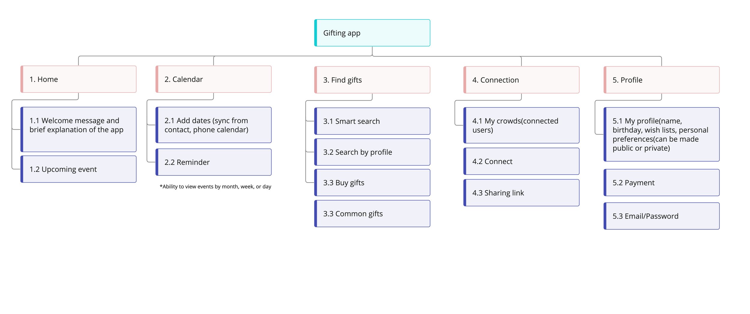
Sitemap ideation
Refined site-map
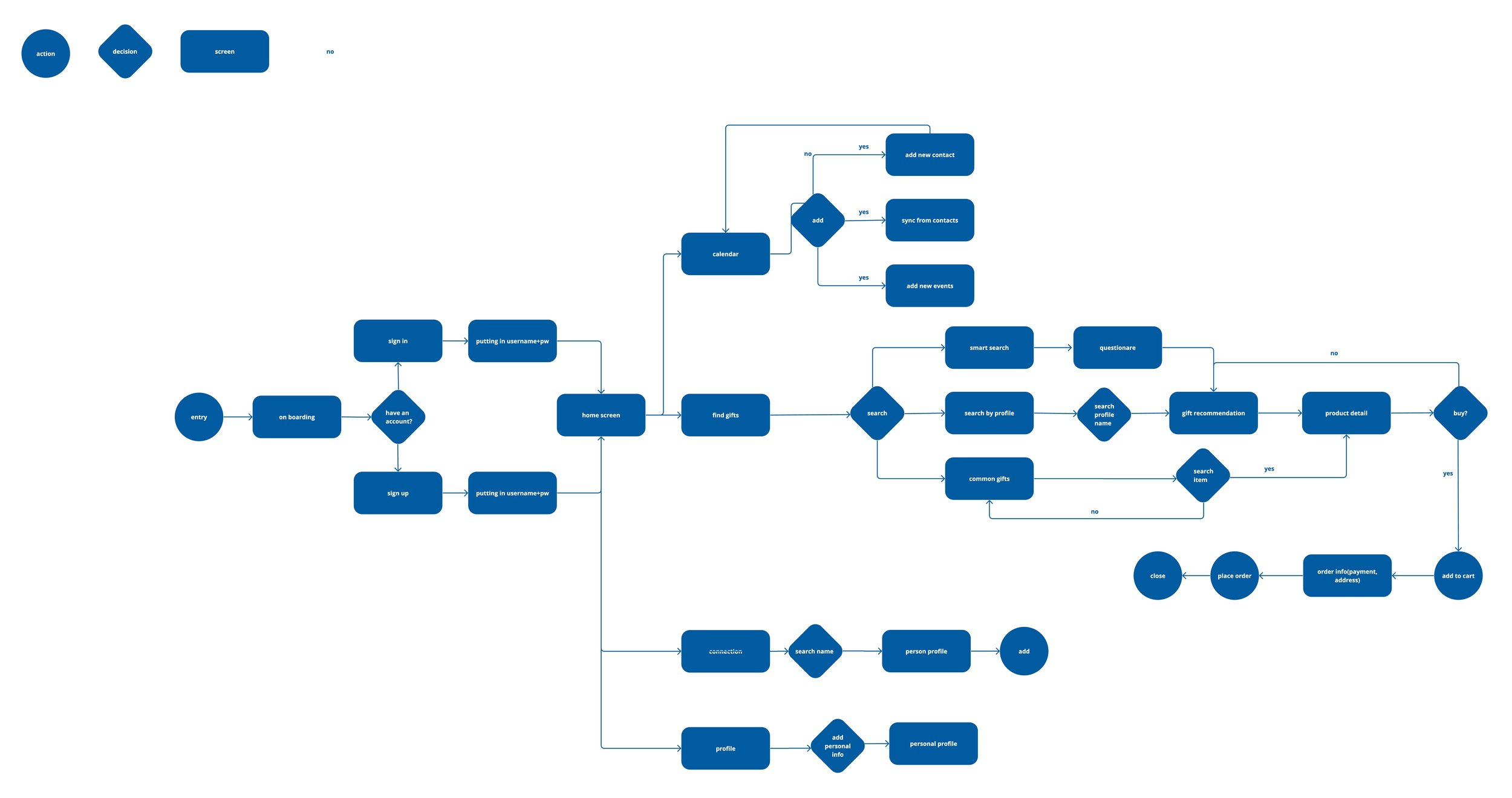
User-flow
Sketches

While not aesthetically polished, the sketches serve as a visual representation, helping me gauge the number of screens required for the app and where each element should be.
Low-fi Wireframe
Based on my sketches, I created low low-fidelity prototype. I wanted to emphasize the app's functionality and information hierarchy rather than visual aesthetics. This helps me in refining the user experience and ensuring that all essential features are in place.


4. SOLUTION
I selected a vibrant yet balanced color palette to infuse the app with cheerful energy while maintaining a modern feel. The logo draws inspiration from the Genie character, symbolizing the fulfillment of wishes. To complement this, I opted for a serif font that harmonizes with the mark's interplay of thick and thin elements.
5. DELIVERABLES
The final product is an app with three key features, simplifying the task of staying organized with important dates and making personalized gift-finding a hassle-free experience.

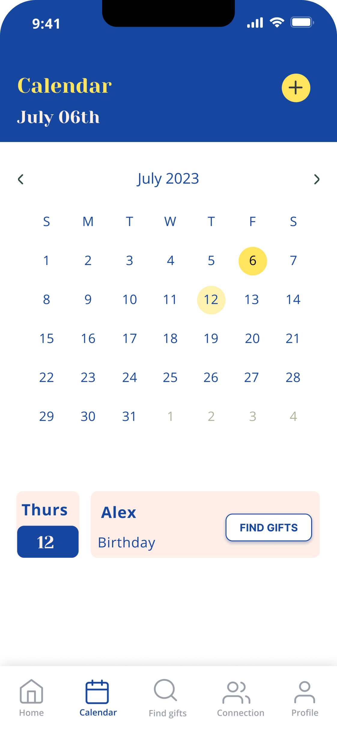
Calendar feature
Users receive reminders for important dates and are guided to discover gifts.

Smart search feature
Users efficiently find gifts through our prompt-driven system.

Personalized gift-recommendation features
Our system will provide gift recommendations tailored to the recipient's profile and preferences.
Other screens
On boarding


Sign in, sign up, my profile


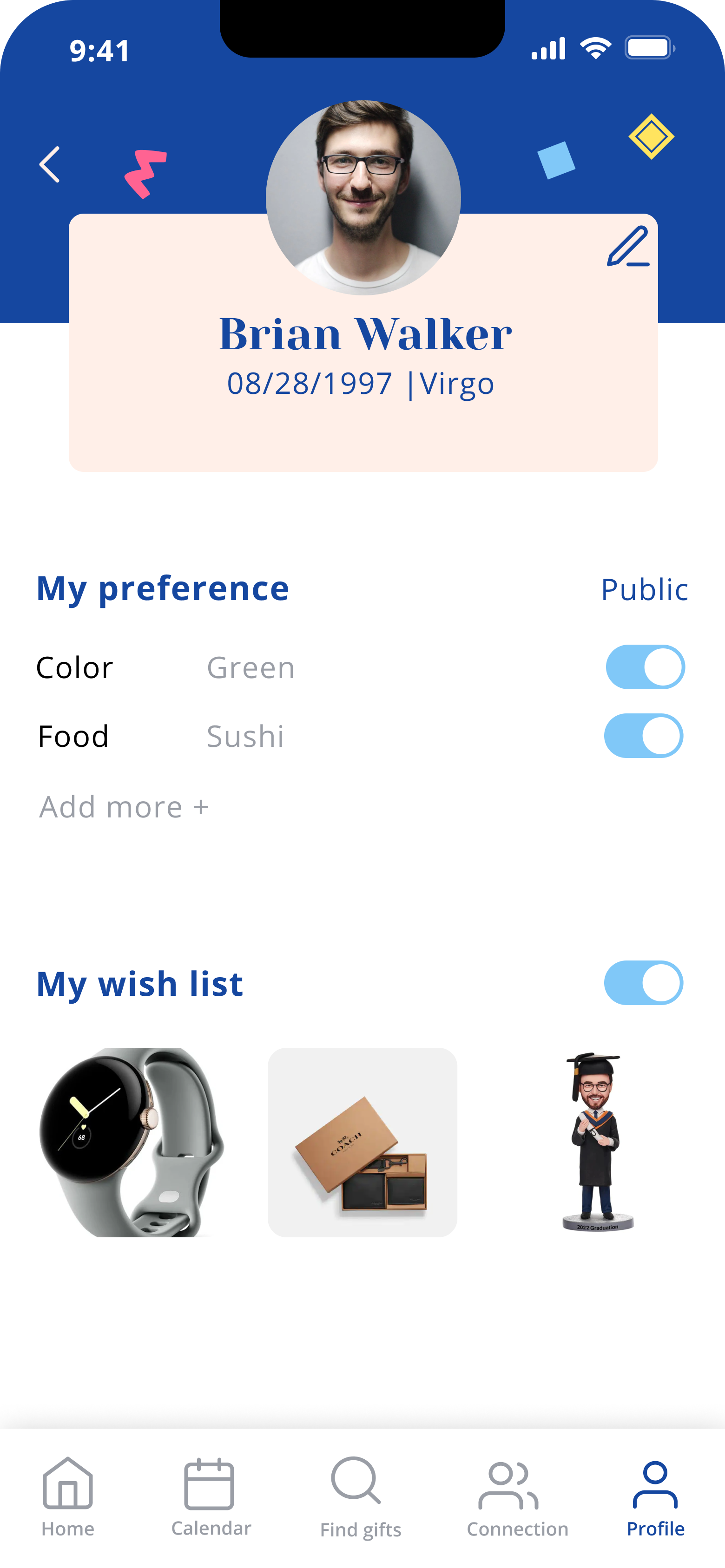
Home, calendar, add event, event



Find gifts

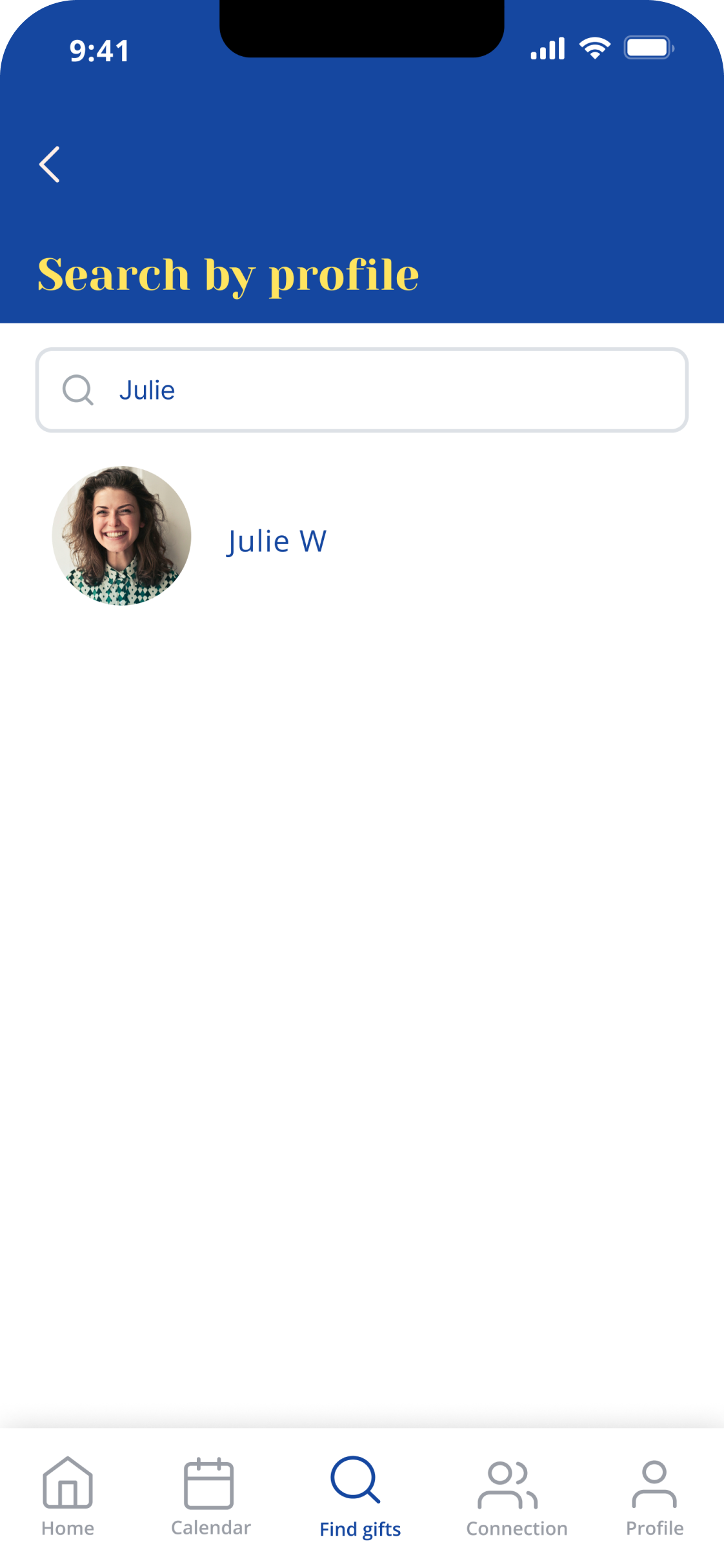


Product details, cart, place order, confirmation


Connection, add connection


REFLECTION
Thoughts:
Throughout the 8 weeks of developing my senior project, I am happy with the solution I have developed, and I think is a strong foundation to continue to improve upon.
My primary focus has been on ensuring inclusivity and avoiding cultural bias in the gift recommendations. This has been achieved by personalizing AI-generated ideas based on user preferences.
Given more time:
I would prioritize conducting ongoing usability testing to continuously refine and optimize the app. I want to acknowledge that the app's purpose is to serve as a reminder for important dates and make gifting an easier process to foster connections.
However, I am aware of the unintended consequence of inadvertently reinforcing societal gifting expectations. So the next potential way to solve this might be sending a personalized virtual card, message, or virtual drawing.